

What happens when a coffee shop and a jazz bar collide?
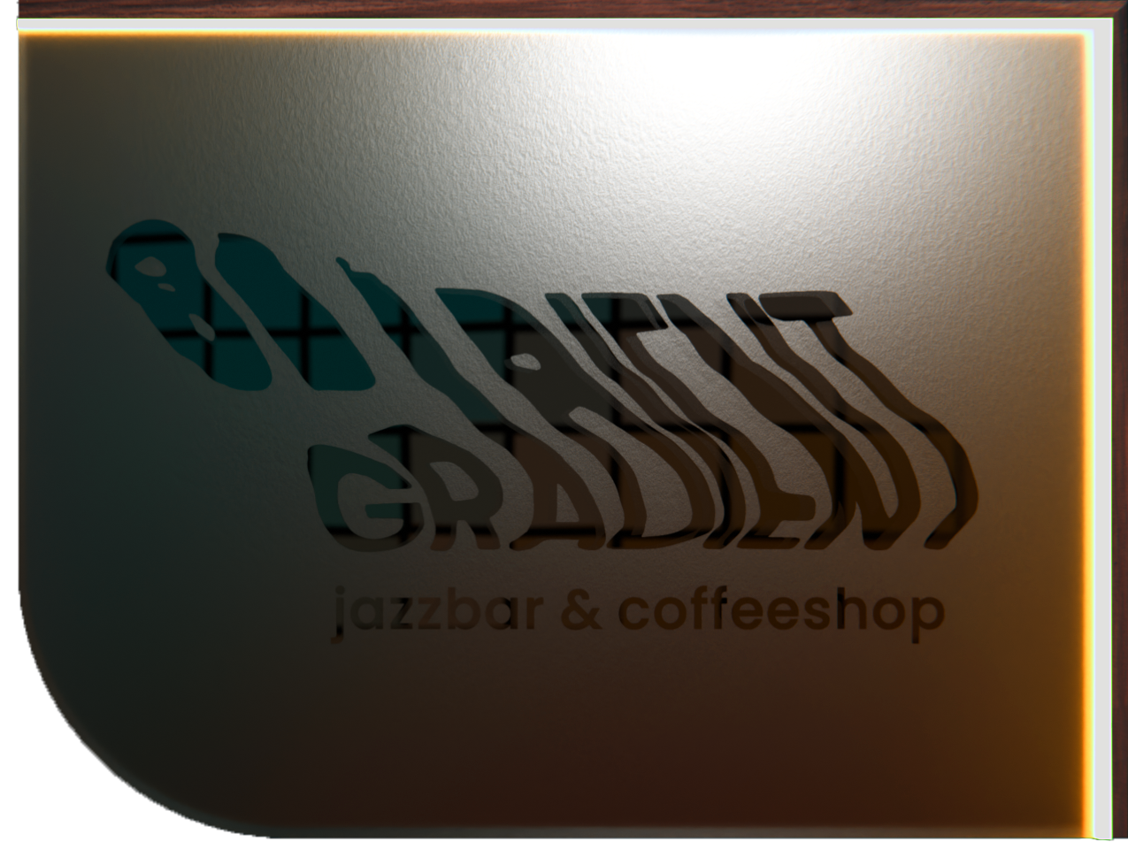
Gradient is the visual concept for this case.
Specially designed for a Café location in Krefeld City.
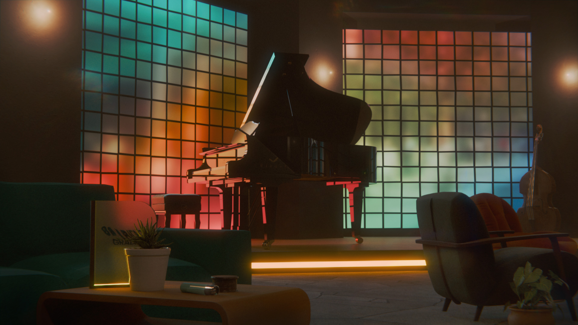
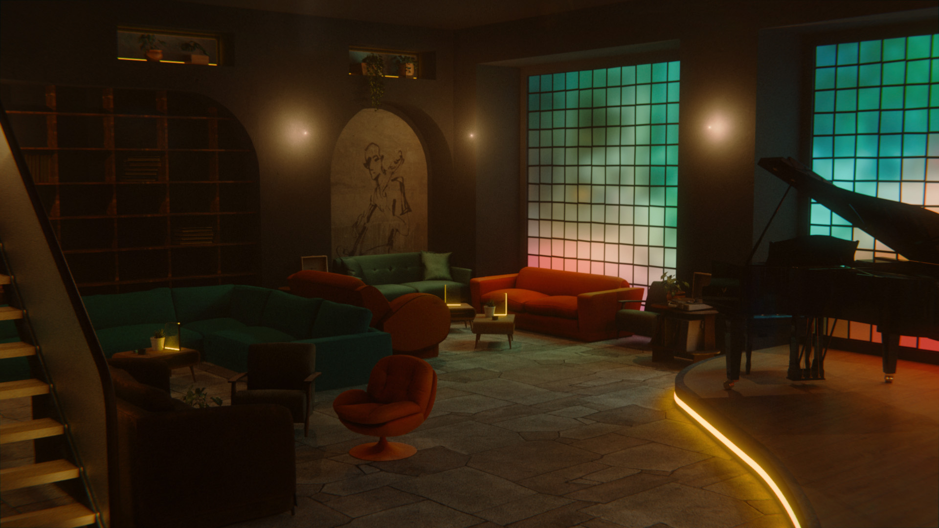
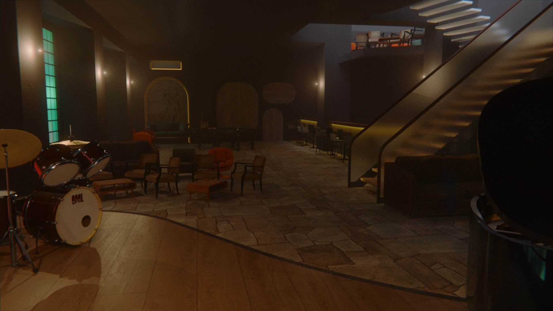
Enjoy Gradient’s cozy atmosphere with live music and dimmed lighting. Stained glass windows isolate the Gradient’s interior from the outside world, offering a safe haven from the hustle of everyday life.
Whether it’s tea, coffee or hot chocolate, take something warm to drink and make yourself comfortable…
Sit on the comfortable sofas and listen to relaxing jazz music. Have a cup of coffee or tea, nibble on some finger food and take a well-deserved break.
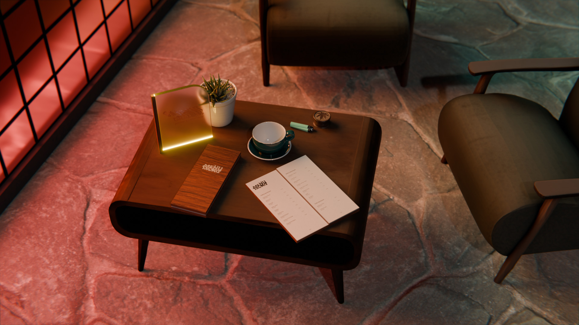
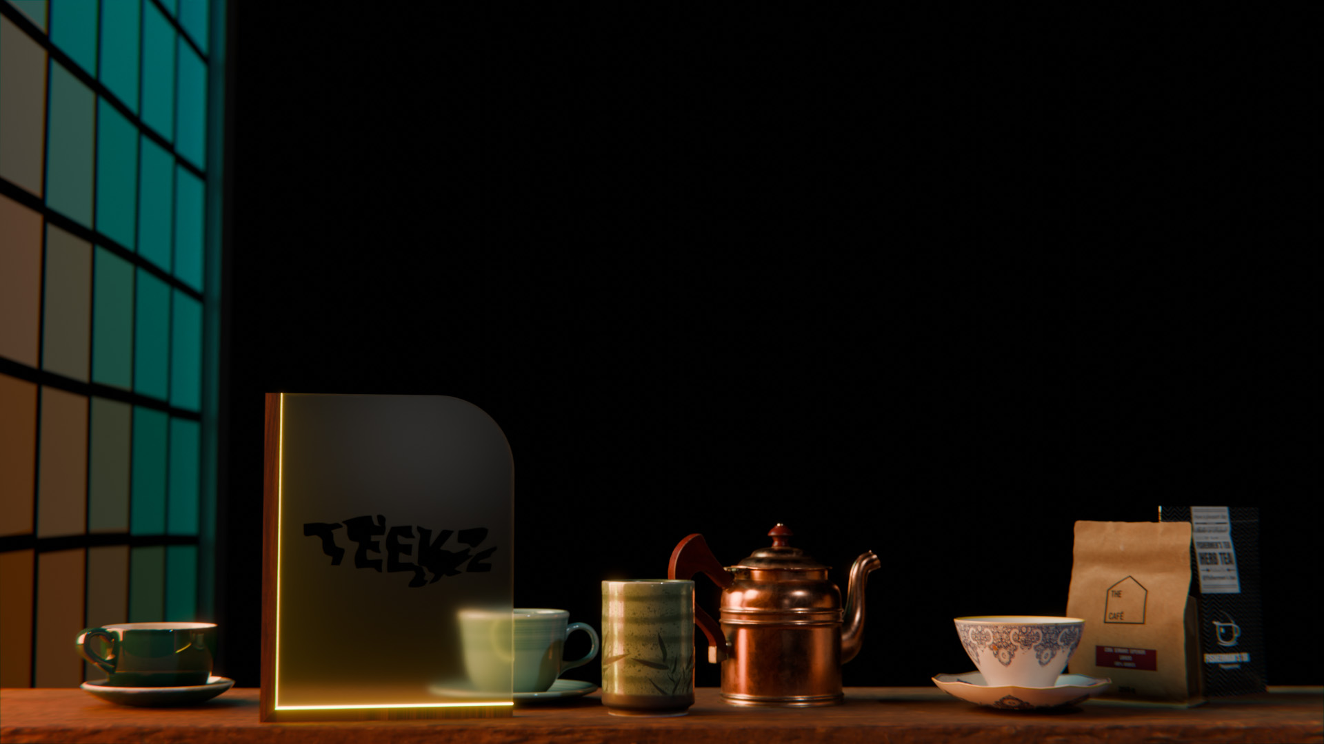
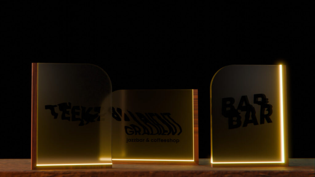
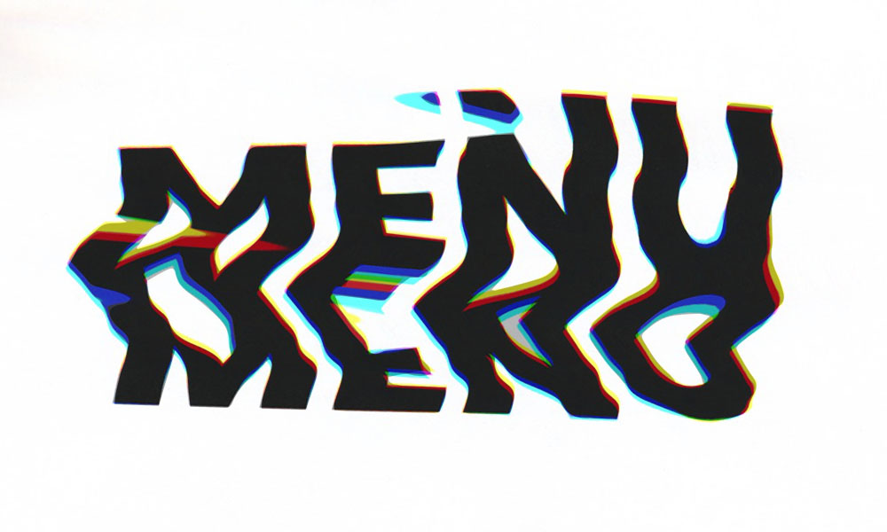
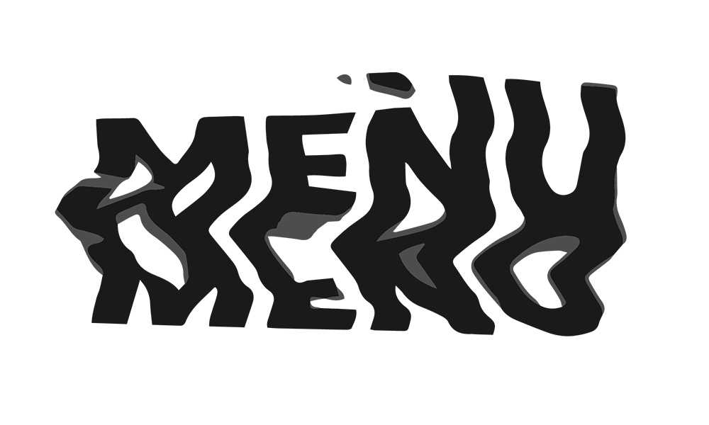
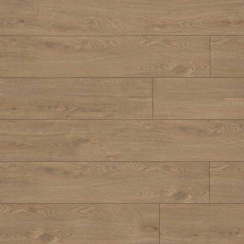
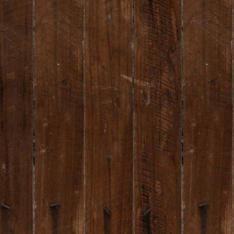
The Menu, made out of a wooden cover with an embedded menu
logo made of slightly rough metal, shows you all diverent fingerfoods, drinks and strains you can order. Roughly scooped hemp paper feels good in the hand and is interesting to the touch.
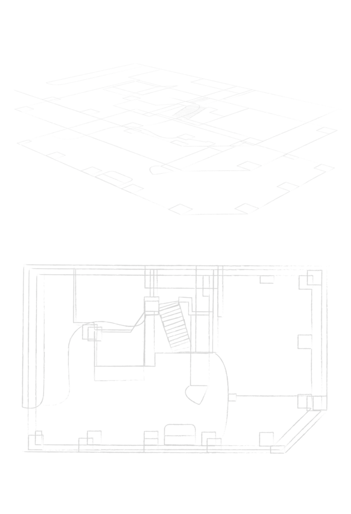
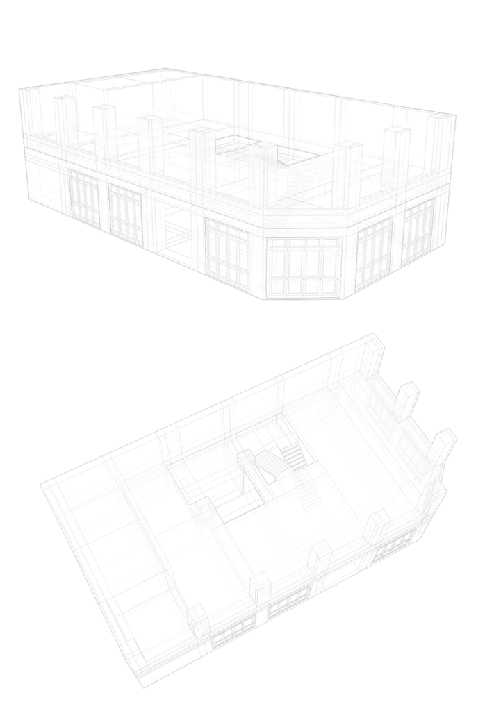
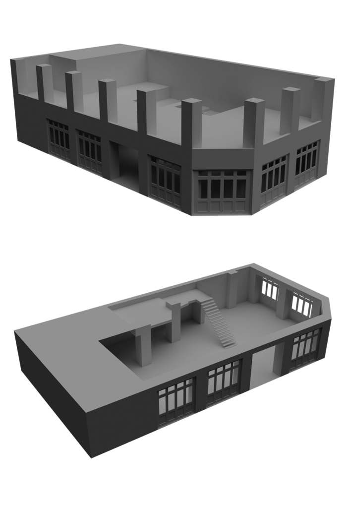
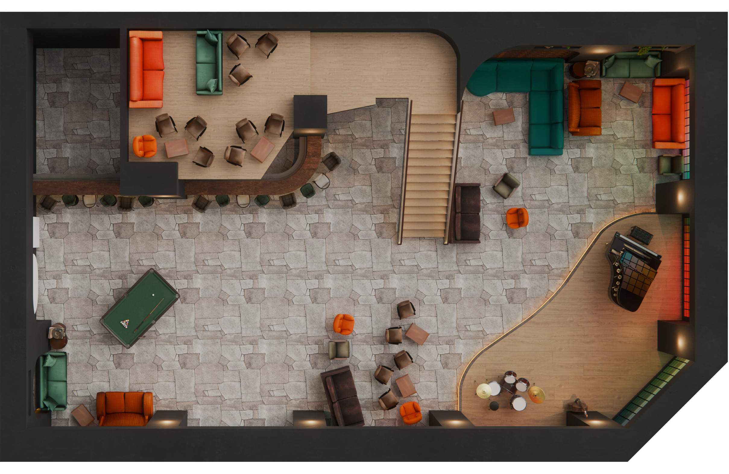
The aim of this project was to create a visual identity for a jazz club with a coffee shop. The first task was to find a suitable location in the city centre of Krefeld, as I didn’t want to create a fictional space, but wanted the project to be practically realisable. Once the café was measured and the floor plans drawn, I went into Blender and recreated the floor plans of the building. This 3D object gave me the opportunity to start from scratch and furnish the building from the ground up.
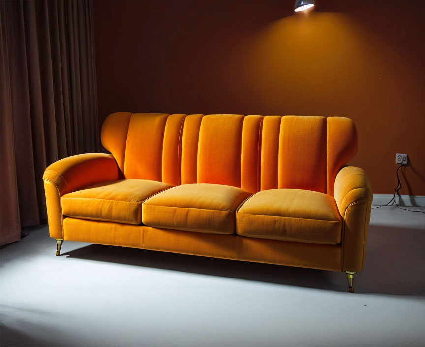
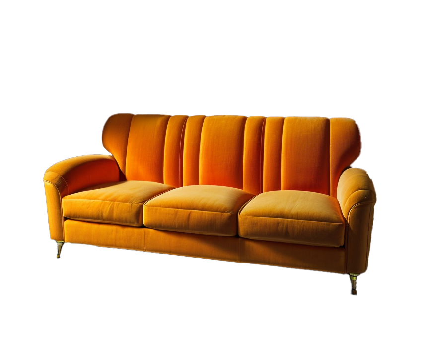
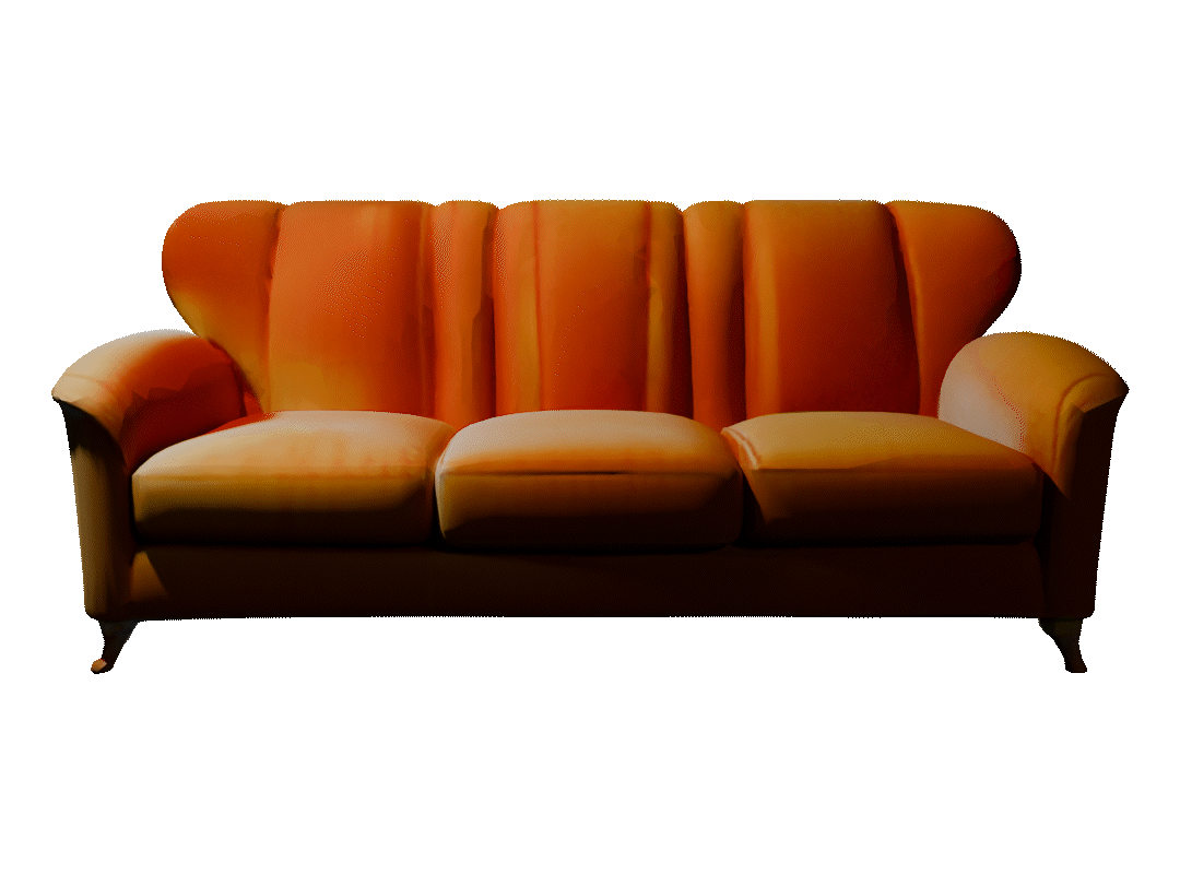
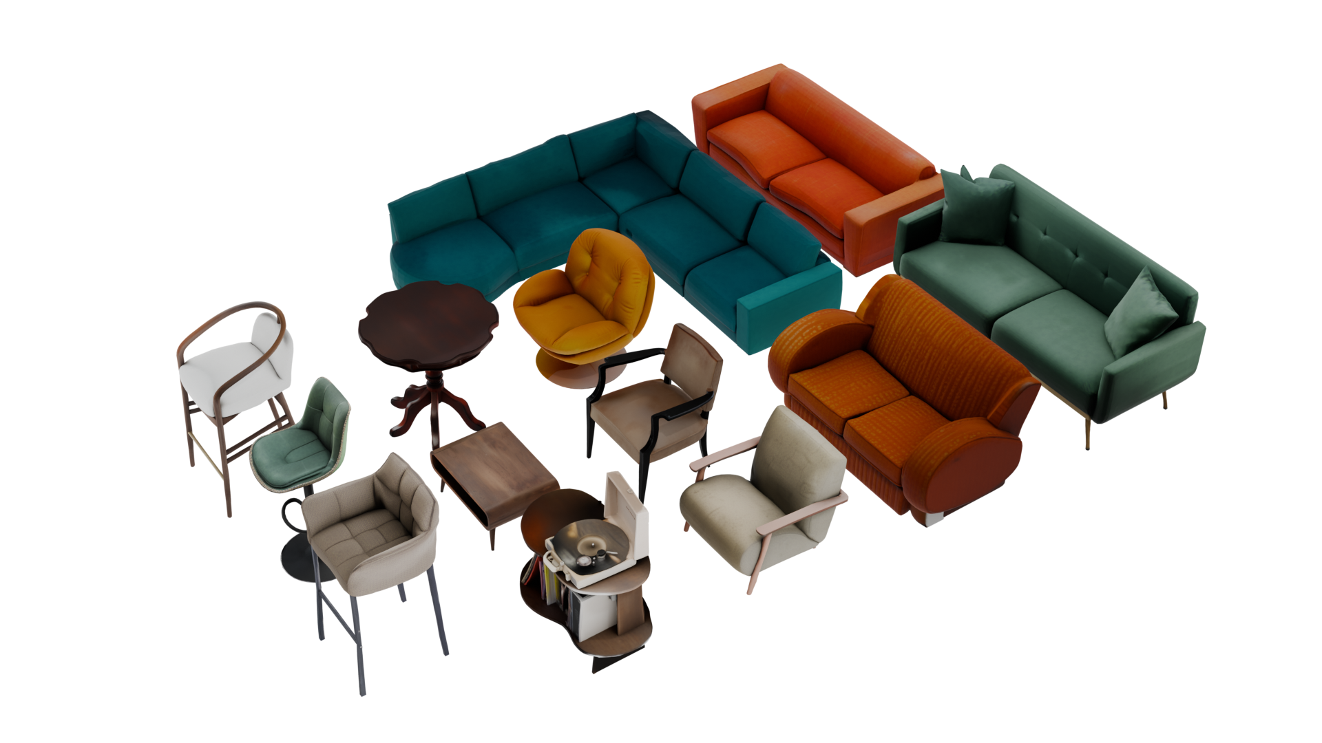
All frames you have seen on the top were rendered an created in Blender. I textured the surfaces, built the furniture, the bar and the decorations to create an attractive room design, which was quite time-consuming. But then I was recommended an AI, an image to 3D object workflow, which worked surprisingly well. So I was able to create my 3D furniture based on images.
AI generated image
input image
output 3D object
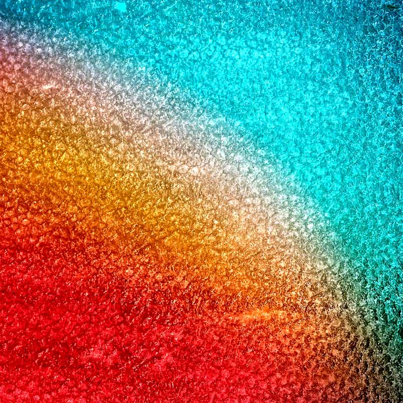
The name ‚Gradient‘ for the Jazz Bar is derived from the colour gradient of the spotlight in a dark, smoke-filled room, as is common in Jazz Bars. Similarly, as the bluenotes say, there are no right or wrong tones in jazz music, but rather a gradient between appropriate and inappropriate. In order to standardise the look and feel of the jazz club, I have a set up a few visual guidelines.
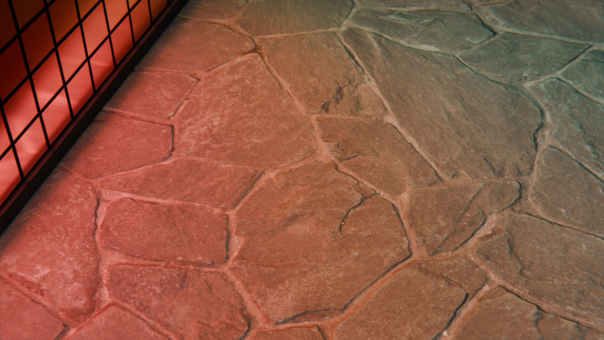
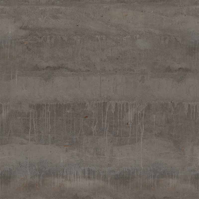
The stained glass shields the outside world from Gradient’s sheltered interior and is the eye-catcher when entering the bar. It casts colourful gradients of light around the room and is exciting for the eye.
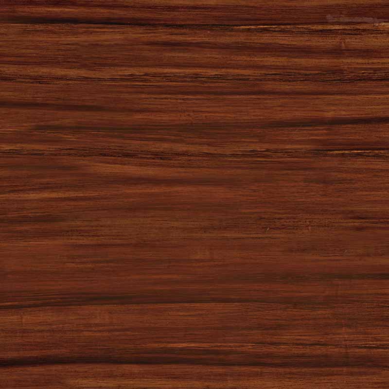
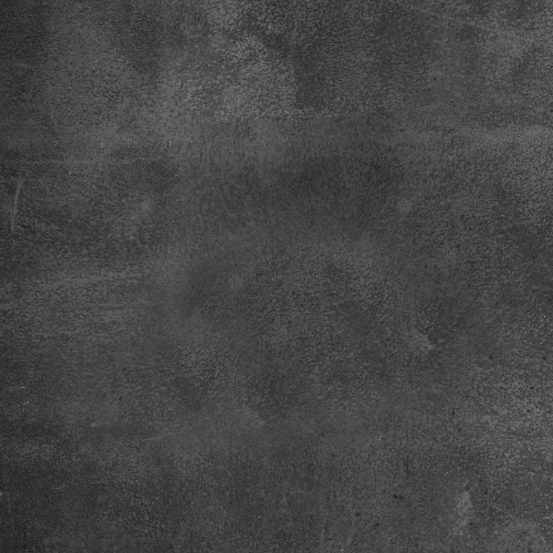
Matt frosted glass is used for bar signage and, for example, in the staircase banister. In combination with the light strip in the staircase, it visually shows the origin of the name of the gradient. A gradient of light to black, visualised by the smoke.
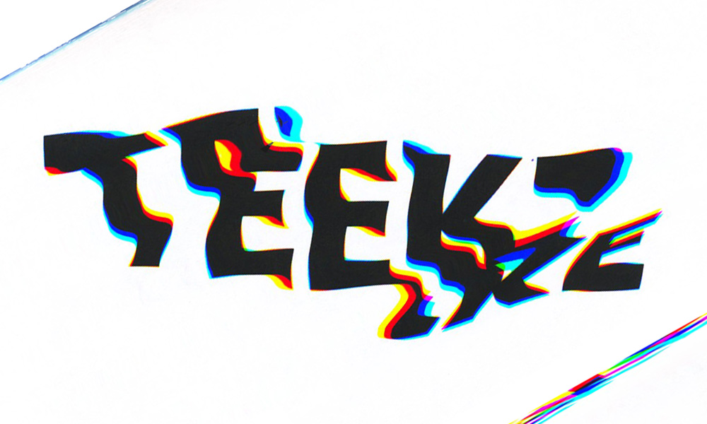
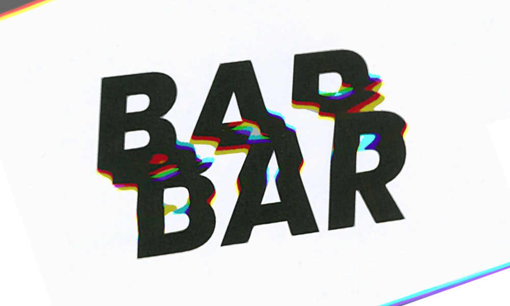
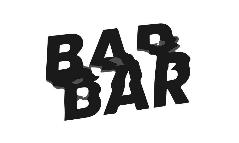
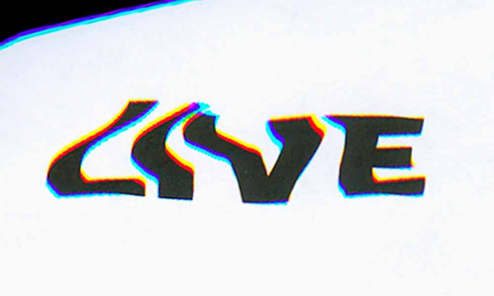
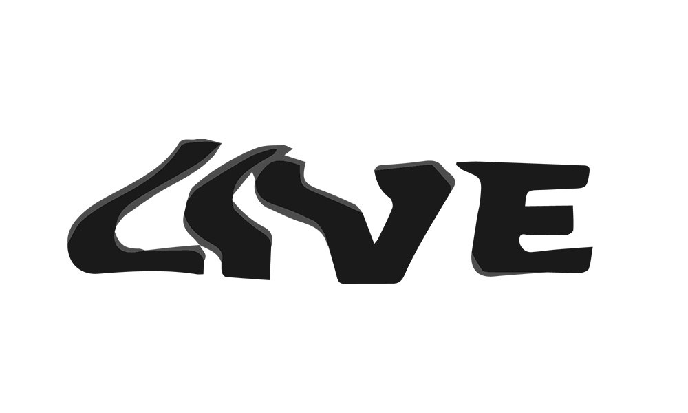
The source font is Poppins. It was printed and distorted analogue in a scanner. This creates the slightly blurred letters that visually illustrate the feeling of jazz music.